Tidy Data with Python and Pandas: A Quick Primer
1. Introduction
One of the first steps in data preparation is in creating a ‘tidy’ dataset. Hadley Wickham states in his paper Tidy Data that Tidy Data has the following three characteristics:
- Each Variable forms a column
- Each Observation forms a row
- Each type of Observational Unit forms a table
This should be familiar to those of you who have experience with dimensional data modeling (see The Data Warehouse Toolkit by Ralph Kimball and Margy Ross). Ideally we want a dense, long table to work with that has data at a consistent grain.
2. The Dataset
Let’s look at how we would do this in Python on the Coronavirus dataset provided by the Johns Hopkins University Center for Systems Science and Engineering (repo available here). More specifically, we’ll be using the data presented in time_series_covid19_deaths_US.csv to create line chart by state of deaths due to COVID-19.
Lets look at some of the data for Maryland:
import pandas as pd
import numpy as np

raw_data = pd.read_csv('../csse_covid_19_data/csse_covid_19_time_series/time_series_covid19_deaths_US.csv')

print(raw_data[raw_data['Province_State']=='Maryland'].head(10))
output:
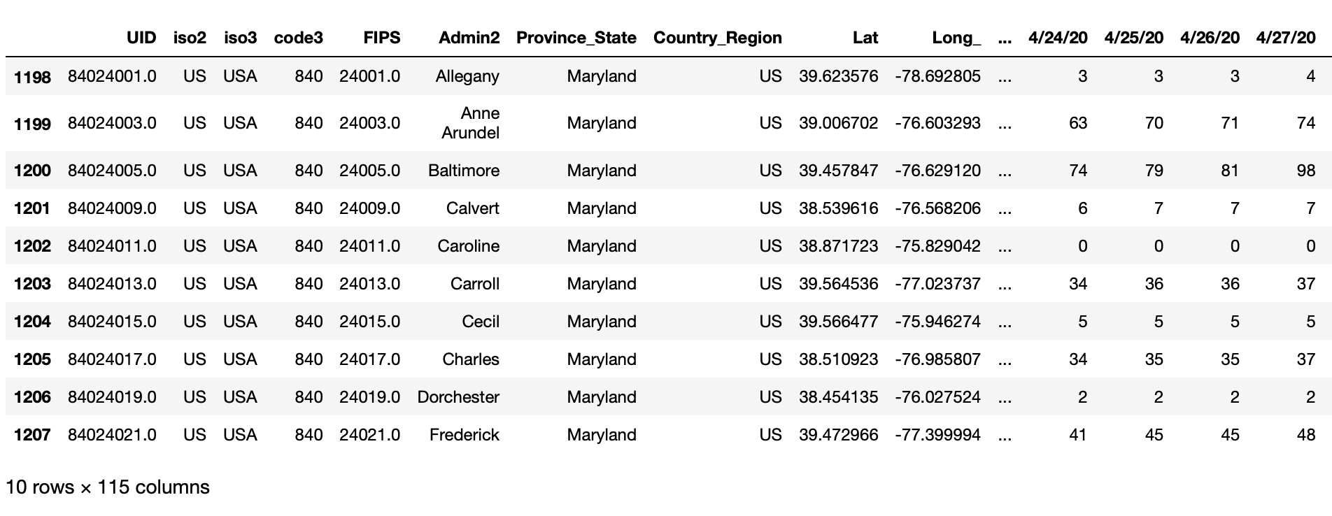
We can see that this time series dataset has 115 columns, most of which represents date values. We can also see that the data is at the County level, shown in the column 'Admin2'.
While this data does have each Observation forming a Row (by 'Province_State' and 'Admin2' ) and has each type of Observational Unit (deaths) in a single Table, it is not a tidy dataset because the Variable ‘Date’ is not represented in a single column. Furthermore, this data is actually at a more detailed granularity than we desire - we want the deaths rolled up by State for higher-level reporting.
To make this data tidy for our needs, we need to do the following:
- Drop the columns we won’t need
- Aggregate the data to the appropriate
'Province_State'level - Transpose the Date columns using the
pandas.melt()function to create a single date column
2.1 Column selection
Let’s begin by dropping the columns we don’t need to get our selected fields:
sel_data = raw_data.drop(['UID', 'Country_Region','iso2', 'iso3', 'code3', 'FIPS', 'Admin2', 'Lat', 'Long_', 'Combined_Key', 'Population'], axis=1)2.2 Aggregation
Then we can aggregate the data at the 'Province_State' level using the .groupby() function. Note that we set as_index=False to flatten the multi-index.
sel_data = sel_data.groupby(['Province_State'], as_index = False).sum()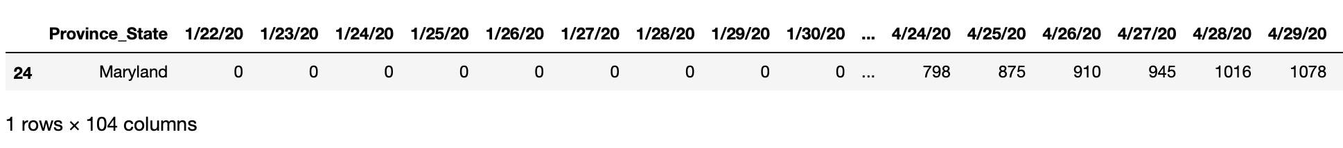
2.3 Pandas.melt()
Lastly, we will need to transpose the data using Pandas.melt()
According to the official documentation, the pandas.melt() function is used to “unpivot a DataFrame from wide to long format, optionally leaving identifiers set”. Let’s see that in action.
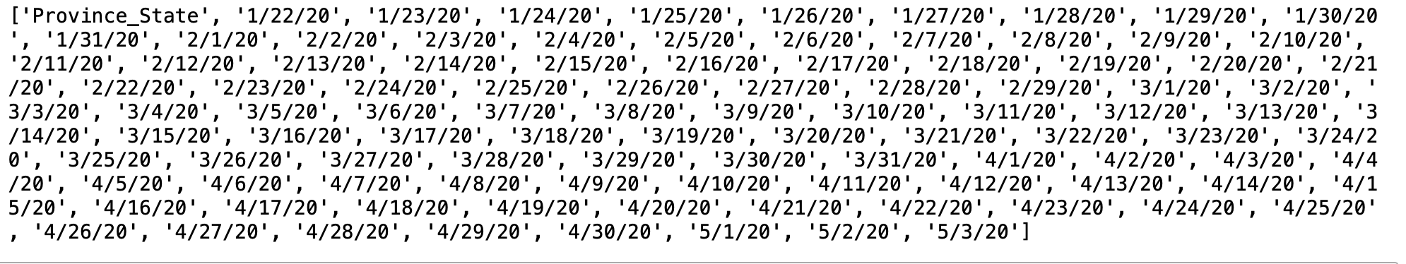
Our columns are as follows:
To get our date columns, we can use integer location based indexing with .iloc() knowing that the first column in our DataFrame is 'Province_State'
date_columns = sel_data.iloc[:, 1:].columns
print(date_columns)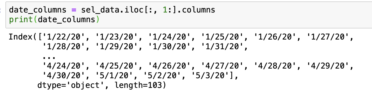
Now we can use Pandas.melt() to transpose the data:
tidy_df = pd.melt(frame = sel_data,
                    id_vars = 'Province_State',
                    var_name = 'Reported_Date',
                    value_vars = date_columns,
                    value_name = 'Deaths')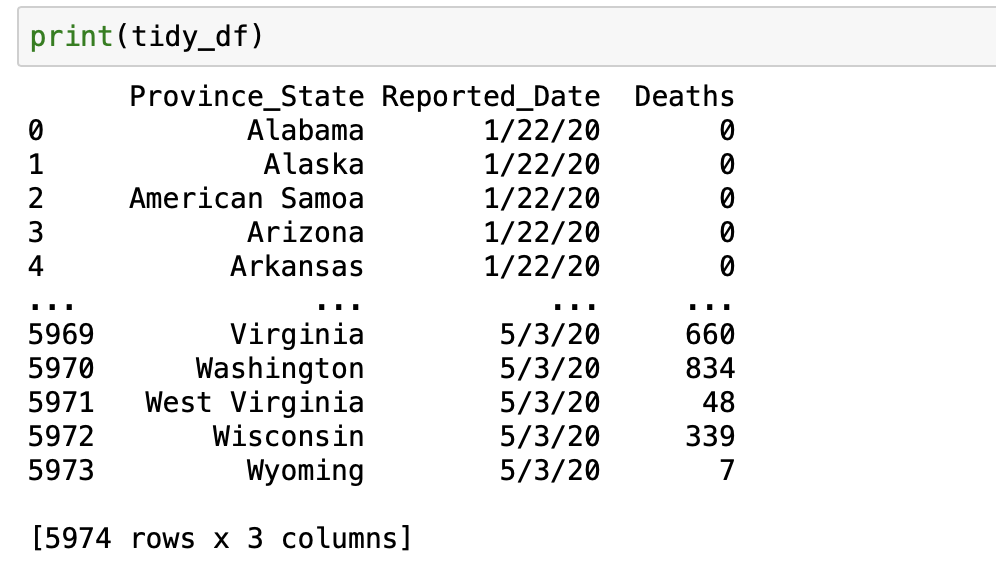
3. Conclusion
As you can see, the .melt() function is both powerful and convenient in converting cross-tabular data to tabular data. I’ll be using this dataset in future posts to create some quick visualizations in future posts. Thanks for reading!